Logo
Brand Identity
SensingChange
The final logo needed to feel like a professional, education-centred research project and a movement, making air pollution visible and actionable. Two proposals balanced scientific credibility with activist energy; the second was selected for clarity and symbolic resonance. Process documentation for both proposals follows.
Second logo proposal.
Wordmark-led concept: “air” treated as particulate in the atmosphere. Emphasis on clarity, legibility, and research tone with an activist undercurrent.
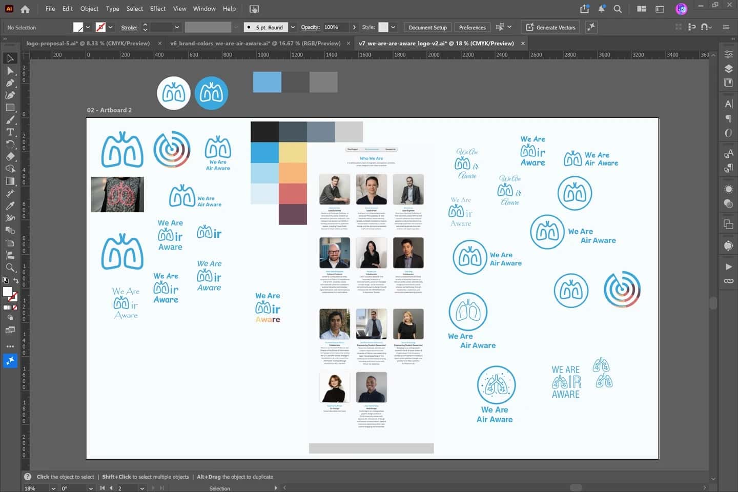
Illustrator files for the second proposal: typographic “air” wordmark explorations.
First logo proposal.
Concept: radar icon sensing an invisible “ghost” in the air. The site was to use a map/radar view for black-carbon hotspots (future work). Colour drew on Canadian Air Quality Health Index cues (originally American; see process screenshots).
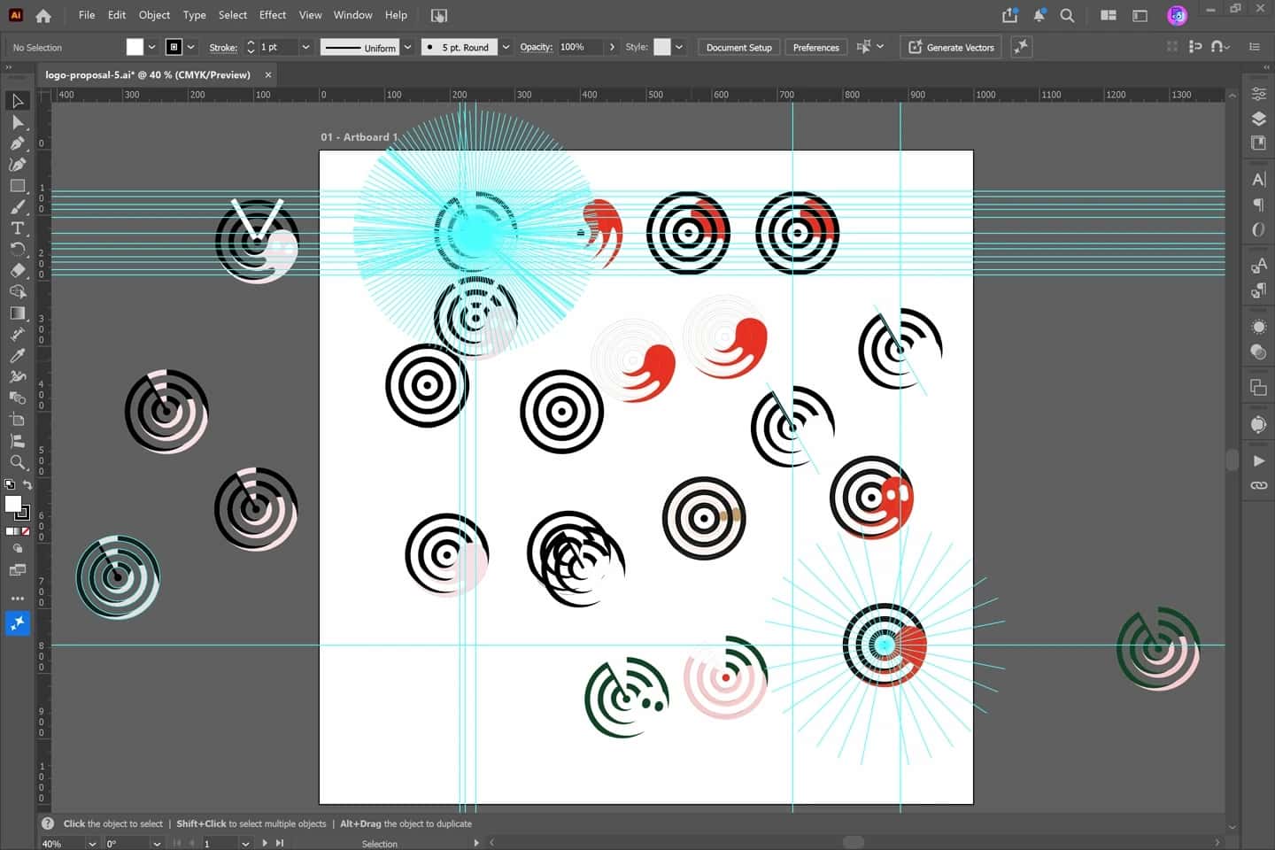
Illustrator files for the first logo proposal, with icon sketches and colour studies.
Animation for the first logo proposal, exploring motion and metaphors for detection, movement, and atmospheric change.
After Effects file for proposal 1 animation: layers, keyframes, and radar effects.